
Branding2025
Bloom.
Packaging and identity direction for a fictional botanical skincare line — soft forms held together by a hard grid.
- Year
- 2025
- Discipline
- Branding
- Client
- Self-initiated concept study

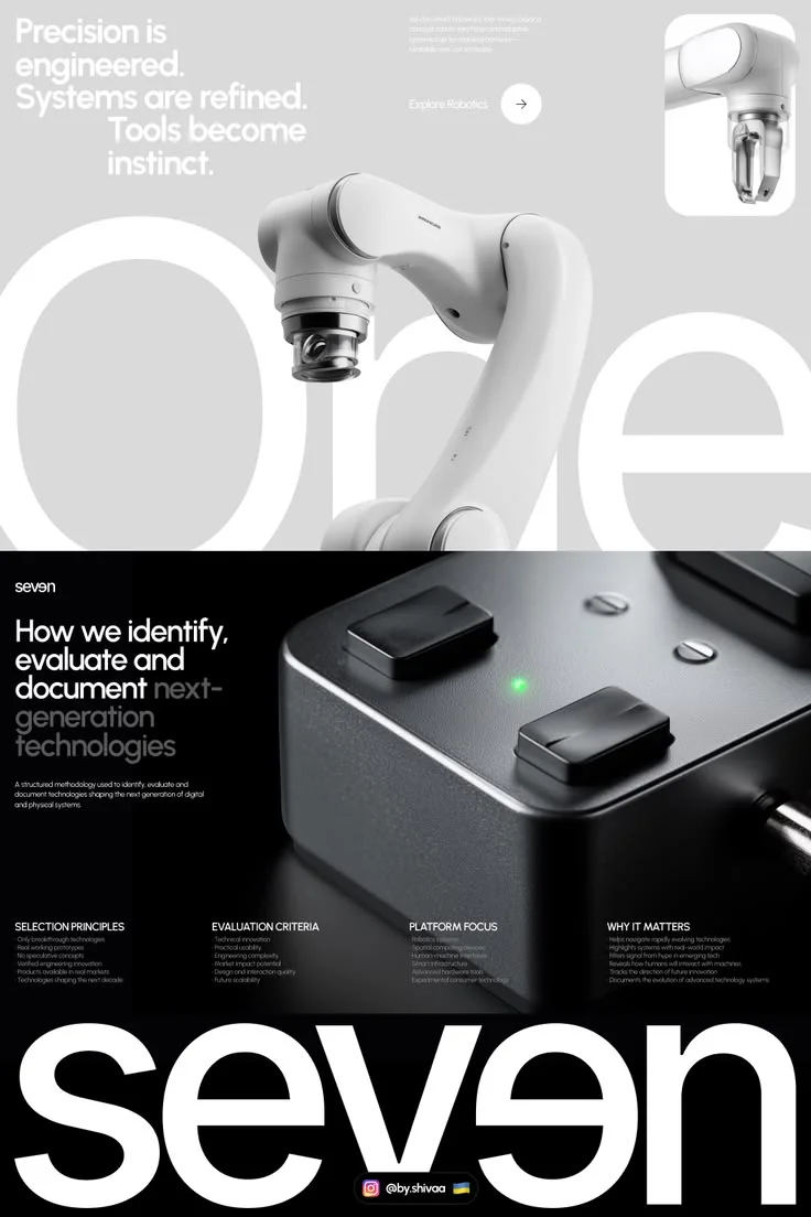
SEVEN — Futuristic Technology Index & Robotics Platform UI🖤
01The project
Bloom is a concept study for a botanical skincare range. The design problem was a familiar tension: botanical brands drift toward the soft and the generic. I wanted warmth without nostalgia, and a shelf presence built on contrast.
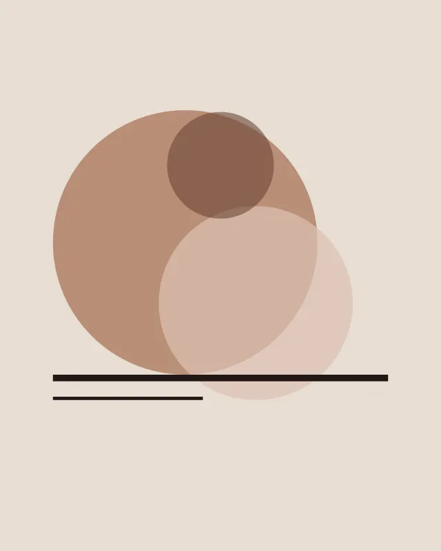
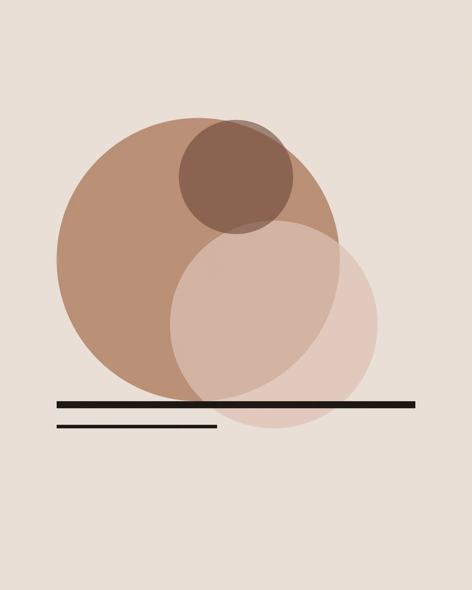
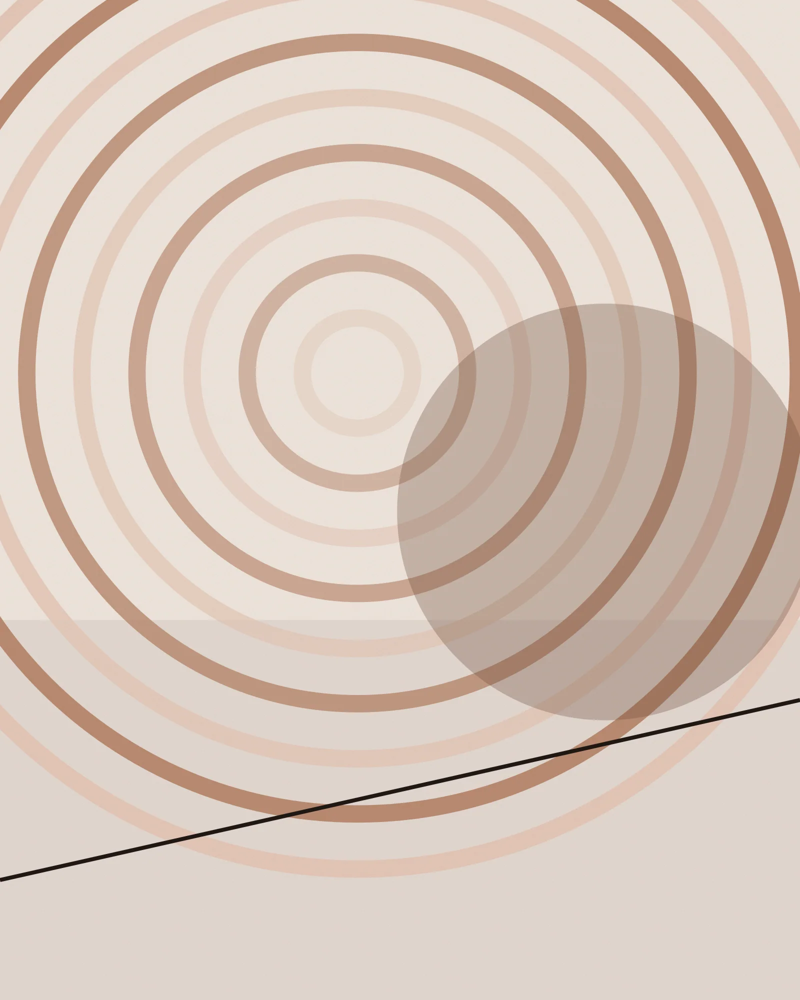
Three offset circles form the core mark. Their overprints behave like translucent pigments, producing a different third colour in every application.
02Objectives
Define a brand direction that feels botanical without cliché, works across cartons, labels and digital, and can be produced in a small batch with two spot colours.
03Creative concept
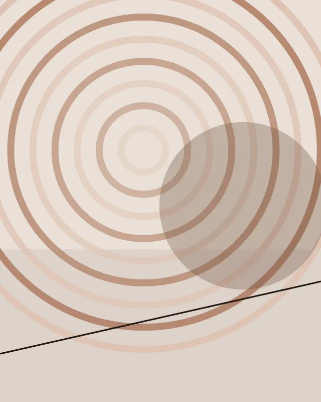
Risograph logic translated into packaging: two translucent inks, generous unprinted paper, and a strict baseline grid that keeps the softness disciplined.
04Design process
Material studies came first — overprinted ink swatches on uncoated stock. I then built the mark and grid, tested dielines at 1:1, and designed a label system that keeps the product name legible at 40 mm.
05Final solution
An identity direction, three carton dielines, a label family, a two-colour print specification, and a small set of social templates.
06Outcome
A complete concept range and print-ready dielines. No commercial launch is claimed.
✳ Selected visuals
3 images
Next project
Northbound
✳ More projects
All work
Field Notes
A modular identity for a field-research journal, built from a single dot grid and a strict typographic spine.

Northbound
A campaign system for a fictional independent music festival — built to survive a wall, a feed and a phone screen.

Grain & Tide
An editorial series about coastlines, told through line, repetition and a restrained material palette.