
Branding2025
Field Notes.
A modular identity for a field-research journal, built from a single dot grid and a strict typographic spine.
- Year
- 2025
- Discipline
- Branding
- Client
- Self-initiated concept study

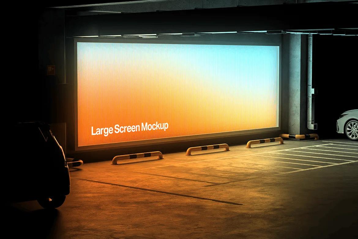
asas
01The project
Field Notes is a self-initiated identity study for a fictional field-research journal. The brief I set myself was simple: make scientific observation feel human without losing its rigour.
The system is built from one primitive — a dot whose radius responds to distance from a focal point. Everything else (covers, spines, section dividers, social templates) is a variation of that rule.
02Objectives
Create an identity that can hold dense academic content while remaining recognisable at thumbnail scale; design a flexible system that a small editorial team could extend without a designer in the room.
03Creative concept
The dot matrix behaves like a lens: dense at the point of observation, quiet at the edges. Paired with a single serif for content and a mono for annotations, the identity reads as an instrument rather than decoration.
04Design process
I began with analogue studies — ink dots on grid paper — then rebuilt the most promising rule as a parametric system. Three cover directions were tested against real article layouts. The final route uses the matrix as a structural device, not a texture: margins, folios and section marks all inherit its rhythm.
05Final solution
A complete identity toolkit: an adaptive dot-matrix generator, wordmark, a four-level typographic scale, print specifications for two paper stocks, and templates for covers, article openers and social announcements.
06Outcome
The study produced a working identity toolkit and a 48-page specimen that demonstrates how the system flexes across formats. It is a concept study, not a commissioned identity.
✳ Selected visuals
4 images





Next project
Bloom
✳ More projects
All workBloom
Packaging and identity direction for a fictional botanical skincare line — soft forms held together by a hard grid.
Northbound
A campaign system for a fictional independent music festival — built to survive a wall, a feed and a phone screen.
Grain & Tide
An editorial series about coastlines, told through line, repetition and a restrained material palette.